Objectives
Rediscover the main features of the Spacebook Play Application. Introduce Semantic UI Framework into the an unstyled version of the application
spacebook-app
Now download an unarchive the source project:
In order to import this, you will need to do the following commands:
cd 'the directory into which you unarchived the project'
play deps
play eclipsify
Then, in eclipse, import the project as an 'existing project'
To run it :
play run
... and browse to:
The app should operate the same as the online version above. However, note that there is no CSS.
Verify this by viewing the source of the app in the browser. In particular, become familiar with the chrome developer tools. These are available in the 'Tools->Developer Tools Menu'. In particular, look at the elements tab in the tools console
Semantic UI
Visit the home page of this open source CSS project:
Download the project archive from the home page and extract. Its contents are structured something this:

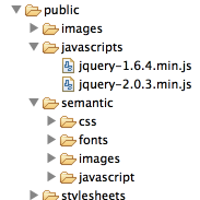
Copy the 'packaged' folder into the public folder of your spaceboook-app. One in there, rename the folder 'packaged' to 'semantic':
We also need to update the version of jquery we are using. Visit the following :
You want to download the latest production version of jquery (2.0.3), and save it to the public/javascripts folder of your spacebook-app project (there is already on older version in there)
If all this goes correctly, the public folder of your project should look like this:
Now, open app/view/main.html, and replace its contents with the following:
<!DOCTYPE html>
<html>
  <head>
    <meta charset="utf-8">
    <title>#{get 'title' /}</title>
    <link rel="stylesheet" type="text/css" href="@{'/public/semantic/css/semantic.css'}">
    <script src="@{'/public/javascripts/jquery-2.0.3.min.js'}"></script>
    <script src="@{'/public/semantic/javascript/semantic.min.js'}"></script>
  </head>
  <body>
    #{doLayout /}
  </body>
</html>
Run the app again. There should be differences in the UI yet.
Menus
We can not make use of the Semantic UI menu feature. This is documented here:
Here is a replacement for `views/accounts/index.html', which is the start page of our app:
#{extends 'main.html' /}
#{set title:'Welcome to Spacebook' /}

<nav class="ui menu">
  <a class="item" href="/signup"> Signup  </a>
  <a class="item" href="/login">  Login   </a>
</nav>

<p> Signup or Log in to the Spacebook Service </p>
We have just the menu section. Reload the home page, and you should see a menu instead of the bulleted list.
Here is the menu section for `views/login.html':
<nav class="ui menu">
  <a class="item" href="/signup"> Signup  </a>
  <a class="active item" href="/login"> Login </a>
</nav>
and `views/signup.html':
<nav class="ui menu">
  <a class="active item" href="/signup"> Signup  </a>
  <a class="item" href="/login"> Login </a>
</nav>
Look carefully at the differences between these two navigation bars.
Exercise
Using the above as a reference, replace the menu sections in:
- views/Home/index.html
- view/Members/index.html
- views/Profile/Members/index.html
Such that the all follow the above style.
Segments
We restructure all our pages now to use 'Segments':
These allow us to group related content, and establish a baseline for some simple styling.
Starting with `views/accounts.index.html', refactor as follows:
#{extends 'main.html' /}
#{set title:'Welcome to Spacebook' /}

<nav class="ui menu">
  <a class="item" href="/signup"> Signup  </a>
  <a class="item" href="/login">  Login   </a>
</nav>

<section class="ui segment">
  <p> Signup or Log in to the Spacebook Service </p>
</section>
Reload the page, and note the difference. There are a rang of variations in the segment :
Try each of these in turn:
<section class="ui raised segment">
<section class="ui stacked segment">
<section class="ui piled segment">
Until you find one you like
Exercise
For all of the views, encapsulate the main section (not the menu) in a segment styled to your choice.
NB: Be sure to keep your indentation consistent! (2 spaces)
Forms
Semantic provides simple and elegant form styles:
These can be introduces into our pages gradually. Start with login.html, which currently should look like this:
#{extends 'main.html' /}
#{set title:'Login to Spacebook' /}

<nav class="ui menu">
  <a class="item" href="/signup"> Signup  </a>
  <a class="active item" href="/login"> Login </a>
</nav>

<section class="ui raised segment">
  <form action="/authenticate" method="POST">
    <label>  Username: </label>
    <input type="text" name="email">
    <label>  Password: </label>
    <input type="password" name="password">
    <input type="submit" value="Login" />
  </form>
</section>
Add 'form' to the "ui raised segment" section like this:
<section class="ui raised form segment">
and examine the effect. If you are unsure of the change, remove it again - look at the form, and then insert a second time.
Now, wrap each of he separate 'fields' in a <div> like this for Username:
    <div class="field">
      <label>  Username: </label>
      <input type="text" name="email">
    </div>
and this for password:
    <div class="field">
      <label>  Password: </label>
      <input type="password" name="password">
    </div>
Reload the app and look at the difference.
Finally, completely replace the submit button with the following:
<button class="ui blue submit button">Login</button>
Reload the page. Its style should closely resemble the login form in the semantic ui documentation:
Here is a complete version of login.html as it should be after the above steps:
#{extends 'main.html' /}
#{set title:'Login to Spacebook' /}

<nav class="ui menu">
  <a class="item" href="/signup"> Signup  </a>
  <a class="active item" href="/login"> Login </a>
</nav>

<section class="ui raised form segment">
  <form action="/authenticate" method="POST">
    <div class="field">
      <label>  Username: </label>
      <input type="text" name="email">
    </div>
    <div class="field">
      <label>  Password: </label>
      <input type="password" name="password">
    </div>
    <button class="ui blue submit button">Login</button>
  </form>
</section>
Exercises:
Using the above as a guide, and also other examples on the same form page on semantic:
rework signup.html to have this same modern look and feel.
Grid
This is the main section of the home page:
<section class="ui raised segment">
  <h1>${user.firstName} ${user.lastName}</h1>
  <h4>Friends (${user.friendships.size()})</h4>
  <ul>
    #{list items:user.friendships, as:'friendship'}
      <li>
        <a href="/publicprofile/${friendship.targetUser.id}"> ${friendship.targetUser.firstName} ${friendship.targetUser.lastName}
         (<a href="/home/drop/${friendship.targetUser.id}"> drop </a>)
      </li>
    #{/list}
  </ul>
  <h4>Messages</h4>
  #{if user.inbox.size() > 0}
    <ul>
      #{list items:user.inbox, as:'message'}
         <li> ${message.from.firstName} says "${message.messageText}" </li>
      #{/list}
    </ul>
  #{/if}
</section
It contains a list of friends + a list of messages. Ideally, these should be presented in 2 columns. Semantic UI provides the Grid component for this purpose:
Here is a revision of the section above:
<section class="ui raised two column grid segment">
  <div class="row">
    <div class="column">
      <h1>${user.firstName} ${user.lastName}</h1>
      <h4>Friends (${user.friendships.size()})</h4>
      <ul>
        #{list items:user.friendships, as:'friendship'}
          <li>
            <a href="/publicprofile/${friendship.targetUser.id}"> ${friendship.targetUser.firstName} ${friendship.targetUser.lastName}
             (<a href="/home/drop/${friendship.targetUser.id}"> drop </a>)
          </li>
        #{/list}
      </ul>
    </div>
    <div class="column">
      <h4>Messages</h4>
      #{if user.inbox.size() > 0}
        <ul>
          #{list items:user.inbox, as:'message'}
             <li> ${message.from.firstName} says "${message.messageText}" </li>
          #{/list}
        </ul>
      #{/if}
    </div>
  </div>
</section>
Note the superstructure introduced:
<section class="ui raised two column grid segment">
  <div class="row">
    <div class="column">
    ...
    </div>
    <div class="column">
    ...
    </div>
  </row>
</section>
This is the simplest configuration. There is a range of other examples and options demonstrated in the documentation:
Exercises:
Introduce two column layout into the Profile and PublicProfile views.
Tuning
The semantic UI framework encapsulates a complete suit of UI components, which we have just scratched the surface of so far. However, the documentation is very accessible and clear. Here are some adjustments to make to the UI. For each change, make sure to immediately review its appearance in the running application.
Menu
Replace the menu in accounts\index.html with the following:
<nav class="ui inverted menu">
  <header class="header item"> Spacebook </header>
  <div class="right menu">
    <a class="item" href="/signup"> Signup  </a>
    <a class="item" href="/login">  Login   </a>
  </div>
</nav>
and review its appearance. Other options available here:
Exercise
Adjust all of the menu sections to follow this pattern
List
Review the Semantic UI Items:
Examine the user list in Members/index.html again:
<section class="ui raised segment">
  <ul>
    #{list items:users, as:'user'}
      <li>
        ${user.firstName} ${user.lastName}  <a href="members/follow/${user.id}"> (follow) </a>
      </li>
    #{/list}
  </ul>
</section>
This can be restyled using the relevant Semantic UI classes:
<section class="ui raised segment">
  <div class="ui list">
    #{list items:users, as:'user'}
      <div class="item">
        ${user.firstName} ${user.lastName}  <a href="members/follow/${user.id}"> (follow) </a>
      </div>
    #{/list}
  </div>
</section>
Review this in the app. Experiment with some alternatives. For instance, an icon can be introduced for each list item:
Here is an example:
<section class="ui raised segment">
  <div class="ui list">
    #{list items:users, as:'user'}
      <div class="item">
        <i class="user icon"></i>
        ${user.firstName} ${user.lastName}  <a href="members/follow/${user.id}"> (follow) </a>
      </div>
    #{/list}
  </div>
</section>
Exercise
Rework all the lists in the app to follow the above style. For the messages, use the chat icon:
<i class="chat icon"></i>
Segments and Headders
The headers:
and segments:
provide considerable further scope of delivering an attractive, coherent User Experience. Here is how some of the effects can be put to good use:
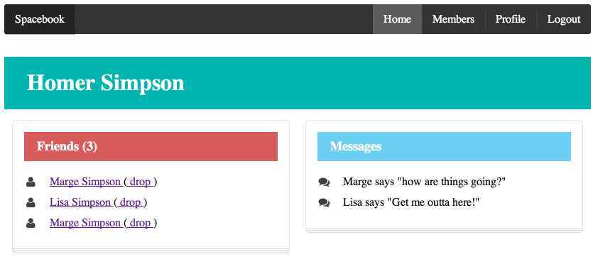
This is the main section of the Home page that produced the above:
<h1 class="ui inverted teal block header" >${user.firstName} ${user.lastName}</h1>
<section class="ui two column grid segment">
  <div class="row">
    <div class="ui column">
      <section class="ui stacked segment">
        <h4 class="ui inverted red block header">Friends (${user.friendships.size()})</h4>
        <div class="ui list">
          #{list items:user.friendships, as:'friendship'}
            <div class="ui item">
              <i class="user icon"></i>
              <a href="/publicprofile/${friendship.targetUser.id}"> ${friendship.targetUser.firstName} ${friendship.targetUser.lastName} </a>
               (<a href="/home/drop/${friendship.targetUser.id}"> drop </a>)
            </div>
          #{/list}
        </div>
      </section>
    </div>
    <div class="column">
      <section class="ui stacked segment">
        <h4 class="ui inverted blue block header">Messages</h4>
        #{if user.inbox.size() > 0}
          <div class="ui list">
            #{list items:user.inbox, as:'message'}
              <div class="item">
                <i class="chat icon"></i>
                ${message.from.firstName} says "${message.messageText}"
              </div>
            #{/list}
          </div>
        #{/if}
      </section>
    </div>
  </div>
</section>
Removing the templating language elements, and just focussing on the HTML, this is the structure:
<h1 class="ui inverted teal block header" >${user.firstName} ${user.lastName}</h1>
<section class="ui two column grid segment">
  <div class="row">
    <div class="ui column">
        <section class="ui stacked segment">
          <h4 class="ui inverted red block header">Friends (${user.friendships.size()})</h4>
          <div class="ui list">
           <div class="ui item">
              <i class="user icon"></i>
           </div>
          </div>
        </section>
    </div>
    <div class="column">
      <section class="ui stacked segment">
        <h4 class="ui inverted blue block header">Messages</h4>
          <div class="ui list">
            <div class="item">
                <i class="chat icon"></i>
             </div>
          </div>
      </section>
    </div>
  </div>
</section>
Read the Semantic UI Documentation on each of the features demonstrated above.
Exercise
Rework the Members, Profile and PublicProfile views to follow this style.
Exercises
Semantic has a Comment view:
which elegantly represents a commenting panel.
Rework the PublicProfile view such that the messages, and comment text area, are rendered using this view. Aim to have the view look something like this:
