Objectives
This weeks lab will give you more practical experience od the box model and specifically how to build a simple multi-column layout using the techniques we have explored in class. You should complete this lab before starting to consider your project in detail.
Setup
In Sublime create a new Lab04 folder. This time we will not be using any content from the previous labs.
In this project create two files:
home.html
home.css
Title the home page "Home Page"
<!DOCTYPE html>
<html>
  <head>
    <meta http-equiv="Content-Type" content="text/html; charset=UTF-8">
    <title>Home Page</title>
  </head>
  <body>
    <h1>
      Lorem ipsum dolor sit
    </h1>
    <p>
      Lorem ipsum dolor sit amet, consectetuer adipiscing elit. Sed feugiat nisi
      at sapien. Phasellus varius tincidunt ligula. Praesent nisi. Duis
      sollicitudin. Donec dignissim, est vel auctor blandit, ante est laoreet
      neque, non pellentesque mauris turpis eu purus.
    </p>
    <p>
      Suspendisse mollis leo nec diam. Vestibulum pulvinar tellus sit amet nulla
      fringilla semper. Aenean aliquam, urna et accumsan sollicitudin, tellus
      pede lobortis velit, nec placerat dolor pede nec nibh. Donec fringilla. Duis
      adipiscing diam at enim. Vestibulum nibh.
    </p>
    <p>
      Nulla facilisi. Aliquam dapibus leo eget leo. Etiam vitae turpis sit amet
      massa posuere cursus. Sed vitae justo quis tortor facilisis ultrices.
      Integer id erat. Donec at felis ut erat interdum vestibulum. Quisque et eros.
      Donec fringilla, est in condimentum venenatis, tortor velit vehicula sem, in
      elementum quam sapien eu lectus. In dolor urna, ullamcorper vel, tempor sit
      amet, semper ut, felis. Praesent nisi.
    </p>
    <p>
      Fusce scelerisque viverra quam. Nam urna. Nullam urna libero, euismod at,
      euismod sit amet, porttitor ac, mauris.
    </p>
    <p>
      Vestibulum interdum aliquet lacus. Vestibulum egestas. Fusce adipiscing
      quam sed metus.
    </p>
    <p>
      Nullam dignissim aliquam dui. Proin laoreet, elit sed pulvinar
      sollicitudin, urna arcu fermentum felis, in rhoncus nunc neque vitae
      libero.
    </p>
    <ul>
      <li>Mauris</li>
      <li>Cras</li>
      <li>Proin</li>
      <li>Integer</li>
      <li>Curabitur</li>
      <li>Integer</li>
      <li>Suspendisse</li>
      <li>Quisque</li>
    </ul>
    <p>
      Proin quis orci eu erat molestie varius. Praesent condimentum
      orci in lectus. Ut ipsum. In hac habitasse platea dictumst.
    </p>
  </body>
</html>
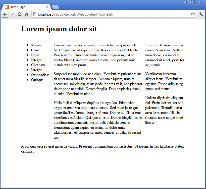
Reloading in the browser, it should look like this:
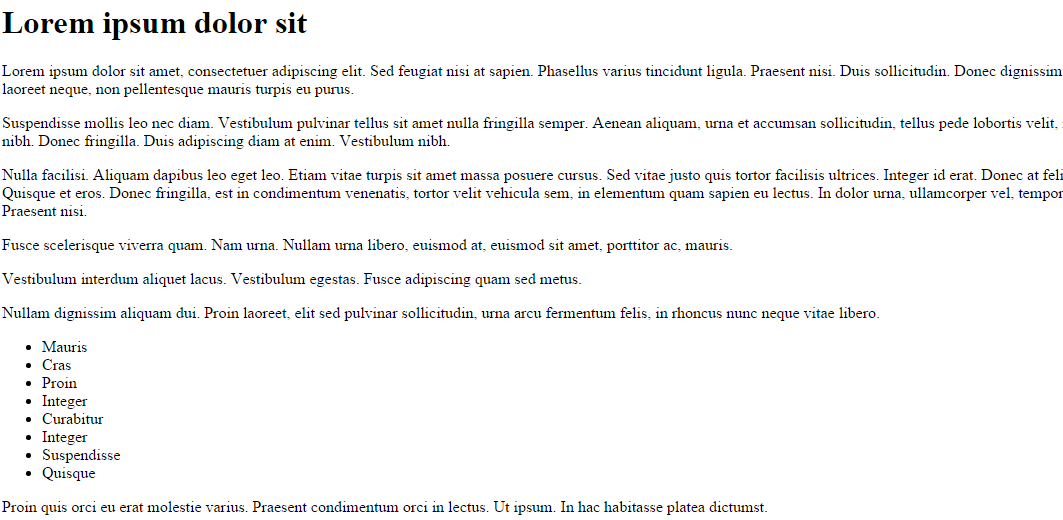
Div
We are now going to divide our content into a series of sections:
header
maincontent
navigation
footer
..using divs.
First the "header":
    <div id="header">
      <h1>
        Lorem ipsum dolor sit
      </h1>
    </div>
Be sure to preserve the indentation as shown
Next "maincontent"
    <div id="maincontent">
      <p>
        Lorem ipsum dolor sit amet, consectetuer adipiscing elit. Sed feugiat nisi
        at sapien. Phasellus varius tincidunt ligula. Praesent nisi. Duis
        sollicitudin. Donec dignissim, est vel auctor blandit, ante est laoreet
        neque, non pellentesque mauris turpis eu purus.
      </p>
      <p>
        Suspendisse mollis leo nec diam. Vestibulum pulvinar tellus sit amet nulla
        fringilla semper. Aenean aliquam, urna et accumsan sollicitudin, tellus
        pede lobortis velit, nec placerat dolor pede nec nibh. Donec fringilla. Duis
        adipiscing diam at enim. Vestibulum nibh.
      </p>
      <p>
        Nulla facilisi. Aliquam dapibus leo eget leo. Etiam vitae turpis sit amet
        massa posuere cursus. Sed vitae justo quis tortor facilisis ultrices.
        Integer id erat. Donec at felis ut erat interdum vestibulum. Quisque et eros.
        Donec fringilla, est in condimentum venenatis, tortor velit vehicula sem, in
        elementum quam sapien eu lectus. In dolor urna, ullamcorper vel, tempor sit
        amet, semper ut, felis. Praesent nisi.
      </p>
      <p>
        Fusce scelerisque viverra quam. Nam urna. Nullam urna libero, euismod at,
        euismod sit amet, porttitor ac, mauris.
      </p>
      <p>
        Vestibulum interdum aliquet lacus. Vestibulum egestas. Fusce adipiscing
        quam sed metus.
      </p>
      <p>
        Nullam dignissim aliquam dui. Proin laoreet, elit sed pulvinar
        sollicitudin, urna arcu fermentum felis, in rhoncus nunc neque vitae
        libero.
      </p>
    </div>
Then "navigation":
    <div id="navigation">
      <ul>
        <li>Mauris</li>
        <li>Cras</li>
        <li>Proin</li>
        <li>Integer</li>
        <li>Curabitur</li>
        <li>Integer</li>
        <li>Suspendisse</li>
        <li>Quisque</li>
      </ul>
    </div>
and finally "footer":
    <div id="footer">
      <p>
        Proin quis orci eu erat molestie varius. Praesent condimentum
        orci in lectus. Ut ipsum. In hac habitasse platea dictumst.
      </p>
    </div>
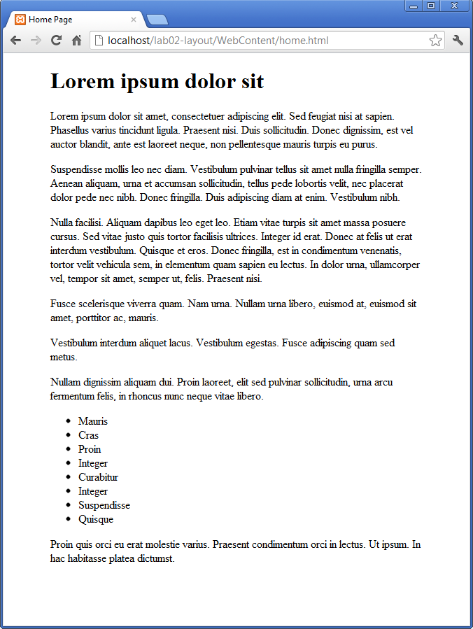
Again, be careful to preserve the indentation. Verify that the home pages appearance has not changed. Finally, experiment with the folding nature of the sublime editor.
For instance, try collapsing everything in the page. This can be done by pressing all of the arrow signs in the left hand margin.
You may be able to generate a view something like this:
Body style
We already have an empty style sheet in place. However, it is not yet linked to our home page.
Insert the following into the <head> element of the home.html to tie in the stylesheet:
<link type="text/css" rel="stylesheet" href="home.css" media="screen" />Now lets try the following simple rule:
body
{
  width: 80%;
  margin: 0 auto;
}
Save, and refresh. The home page should now look like this:

Remember the shortcut rules for CSS. The rule we have introduced is in fact a shorthand for :
{
  width: 80%;
  margin-top: 0;
  margin-bottom: 0;
  margin-left: auto;
  margin-right: auto;
}
Rules can be 'commented out' if you want them to be temporarily removed. Figure out the notation for commenting in CSS, and verify this by commenting out your existing rule, and replacing with this one.
Additionally, discover the equivalent notations for html (quite different).
This rule is stating that we want no top/bottom for the page, however auto for left and right is resizing the margins to be proportional to the container width (the browser window), and equal in size.
The overall effect is a pleasing border on either size of the page, of equal size.
Maincontent
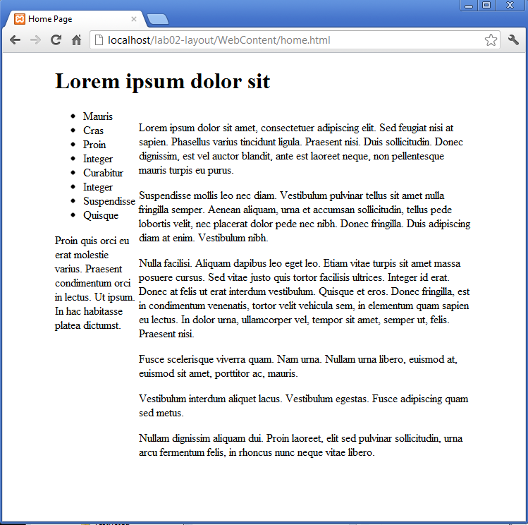
We will now attempt to "float" the "maincontent" section to the right, with the "navigation" section hopefully moving in to the left.
Try the following rule:
#maincontent
{
  float: right;
}
and inspect the results. There should be no change yet. This is because the maincontent section is wide enough to include the full space available. We can adjust this so that is consumes say 80% of the space:
#maincontent
{
  width: 80%;
  float: right;
}
We are now starting to see the beginnings of a multicolumn layout:
To get our bearings a bit better, lets introduce a border around the maincontent:
#maincontent
{
  width: 80%;
  float: right;
  border: dashed thin;
}
-
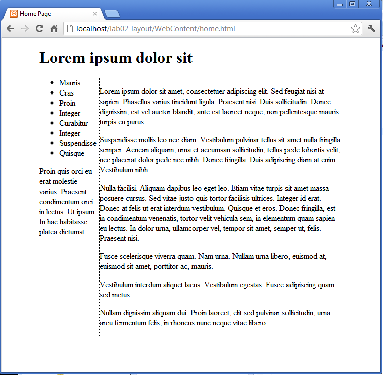
As you can see, the "navigation" and "footer" sections have moved up to the left, slipping inside the maincontent. This is because these sections are current obeying the default layout rules. In effect, they will be automatically resizing the fit the available space liberated by the 20% space of the <body> that maincontent has liberated.
Navigation
We can introduce a rule to definitively tie the navigation to 20% of the parent size. and float it left (also turning on a border so we can visualize it easier)
#navigation
{
  width: 20%;
  float: left;
  border: dashed thin;
}
This produces some alarming results:
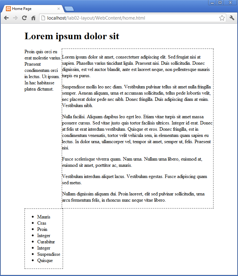
The width refers to the content, not padding and margins, so our true width exceeds the available space, so our navigation has been push below where we intended.
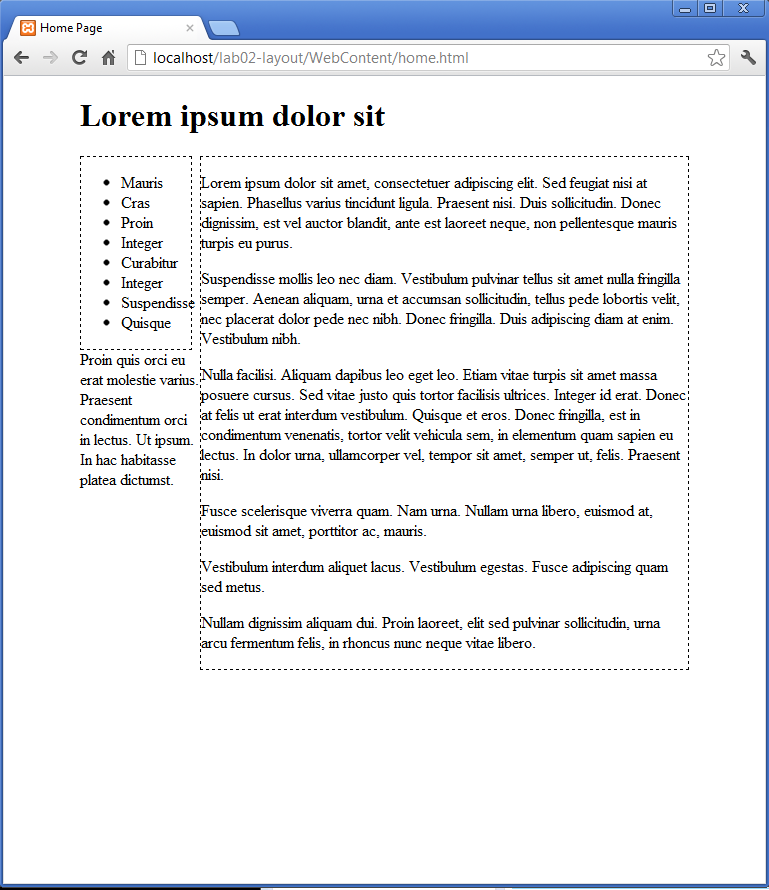
We can easily fix this with a little adjustment:
#navigation
{
  width: 18%;
  float: left;
  border: dashed thin;
}
Experiment with other percentages to get a feel for the layout behaviour
Header, footer
We can now target the headder and footer, and move them into place.
First the header:
#header
{
  width: 100%;
  border: dashed thin;
}
This should not have any effect, as the header, being positioned first, is already in place.
Now try the footer:
#footer
{
  width: 100%;
  border: dashed thin;
}
Save and refresh:
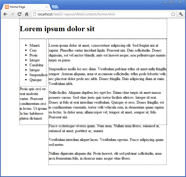
Still not quite right.
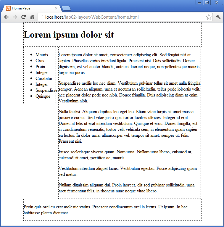
We would like to push the footer "clear" of any existing floated elements, and then for it to occupy the denoted size in that zone. This is accomplished with the "clear" property:
#footer
{
  width: 100%;
  clear: both;
  border: dashed thin;
}
Setting clear to "both", means clear (move below) and blocks floated left or right.
Refresh produces a pleasing result:
Simplify
Our full CSS is now as follows:
body
{
  width: 80%;
  margin: 0 auto;
}

#maincontent
{
  width: 80%;
  float: right;
  border: dashed thin;
}

#navigation
{
  width: 18%;
  float: left;
  border: dashed thin;
}

#header
{
  width: 100%;
  border: dashed thin;
}

#footer
{
  width: 100%;
  clear: both;
  border: dashed thin;
}
Note the repeated border property. We introduced this property so that we could get a clearer view of our sections. Presumable we would like to remove it prior to production. However, this will mean deleting/commenting it out from every rule.
This single property appears in every rule. We can create a new "wildcard" rule as follows:
*
{
  border: dashed thin;
}
Now, we can delete this from all of the other rules:
body
{
  width: 80%;
  margin: 0 auto;
}

#maincontent
{
  width: 80%;
  float: right;
}

#navigation
{
  width: 18%;
  float: left;
}

#header
{
  width: 100%;
}

#footer
{
  width: 100%;
  clear: both;
}
And when we want to remove the border, we can just delete that rule.
Primary, secondary
We can also further subdivide sections within existing sections. The "maincontent" section currently contains 6 paragraphs:
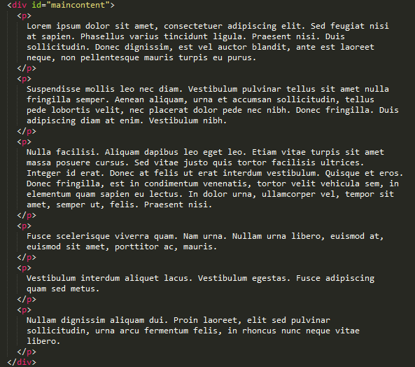
Using nesting, we can divide these into two sections:
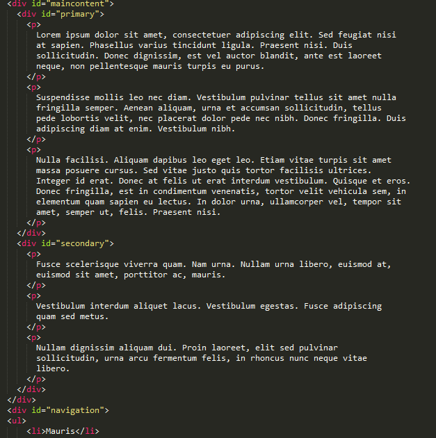
If we fold this carefully, we can see the following structure:
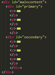
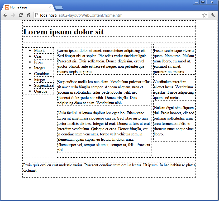
As yet, this has no bearing on the display. However, two simple rules targeting these sections will layout these sections in two columns:
#primary
{
  width: 68%;
  float: left;
}

#secondary
{
  width: 30%;
  float: right;
}
It should render as follows:
If we comment out our wildcard rule:
*
{
  //border: dashed thin;
}
This is the final result:
Exercises
Archive of Completed Lab:
Navigation
Create a copy of home.html - and call it "page1.html". Keeping the other sections intact, delete the content of the "primary" and "secondary" sections.
Insert the following into "primary":
       <p>
          Phasellus non nibh ut lacus elementum pharetra. Vivamus sed orci ipsum.
          Nulla sapien eros, euismod ac ornare sed, consectetur sed dui. Integer gravida
          sem et turpis interdum in convallis eros placerat. Quisque auctor, velit sed
          blandit pharetra, felis diam ultricies erat, vel aliquet neque risus non lacus.
          Etiam non magna tortor, in rutrum augue. Donec nec enim ante, in tincidunt eros.
          Aenean ultrices, ante non scelerisque eleifend, libero dolor rutrum justo,
          vitae iaculis mi est id nisl. Nunc velit odio, luctus in imperdiet eget,
          pulvinar ac quam. Nullam ipsum arcu, euismod vel congue quis, ullamcorper
          sit amet massa. Vivamus et mauris ut ante sagittis sagittis quis eu velit.
</p>- and into secondary, the following:
        <p>
          In faucibus turpis lacus, eget congue magna. Aenean vitae lacus sed mi pretium
          porttitor suscipit sit amet ipsum. Suspendisse potenti. Nunc pharetra consectetur
          est eget tempus. Aenean ac iaculis dui. Morbi volutpat rutrum urna vitae suscipit.
          Vestibulum quam libero, lacinia id varius at, pharetra vitae metus. Proin sit amet
          euismod dolor. Donec varius tempus libero, ut interdum libero accumsan nec. Duis
          id lectus eu sapien dapibus rutrum sed id tellus. Praesent purus purus, adipiscing
          non vehicula in, vehicula eget ligula. Suspendisse massa nibh, condimentum ut ornare
          at, vulputate eu augue. Donec cursus ullamcorper facilisis.
          In iaculis convallis elementum.
        </p>
Our navigation section is currently just a list (without links):
   <div id="navigation">
    <ol>
        <li>Mauris</li>
        <li>Cras </li>
        <li>Proin</li>
        <li>Integer</li>
        <li>Curabitur</li>
        <li>Integer</li>
        <li>Suspendisse</li>
        <li>Quisque</li>
      </ol>
    </div>
This section is duplicated in both sections. Introduce hyper links into each, to provide rudimentary navigation:
   <div id="navigation">
    <ol>
        <li><a href="home.html"> Mauris </a></li>
        <li><a href="page1.html"> Cras </a></li>
        <li>Proin</li>
        <li>Integer</li>
        <li>Curabitur</li>
        <li>Integer</li>
        <li>Suspendisse</li>
        <li>Quisque</li>
      </ol>
    </div>
Save and reload - and you should see basic navigation between the two pages.
Multiple Pages
Create 2 more pages, with different primary/secondary content, and stitch them into the navigation across all page. You can generate some more content here:
You might be interested in the background to this text here: